

- Case
- Discovery & strategy
- Product development
- Brand strategy & identity
- Content & storytelling
- Campaigns & growth
A brand as warm as the care
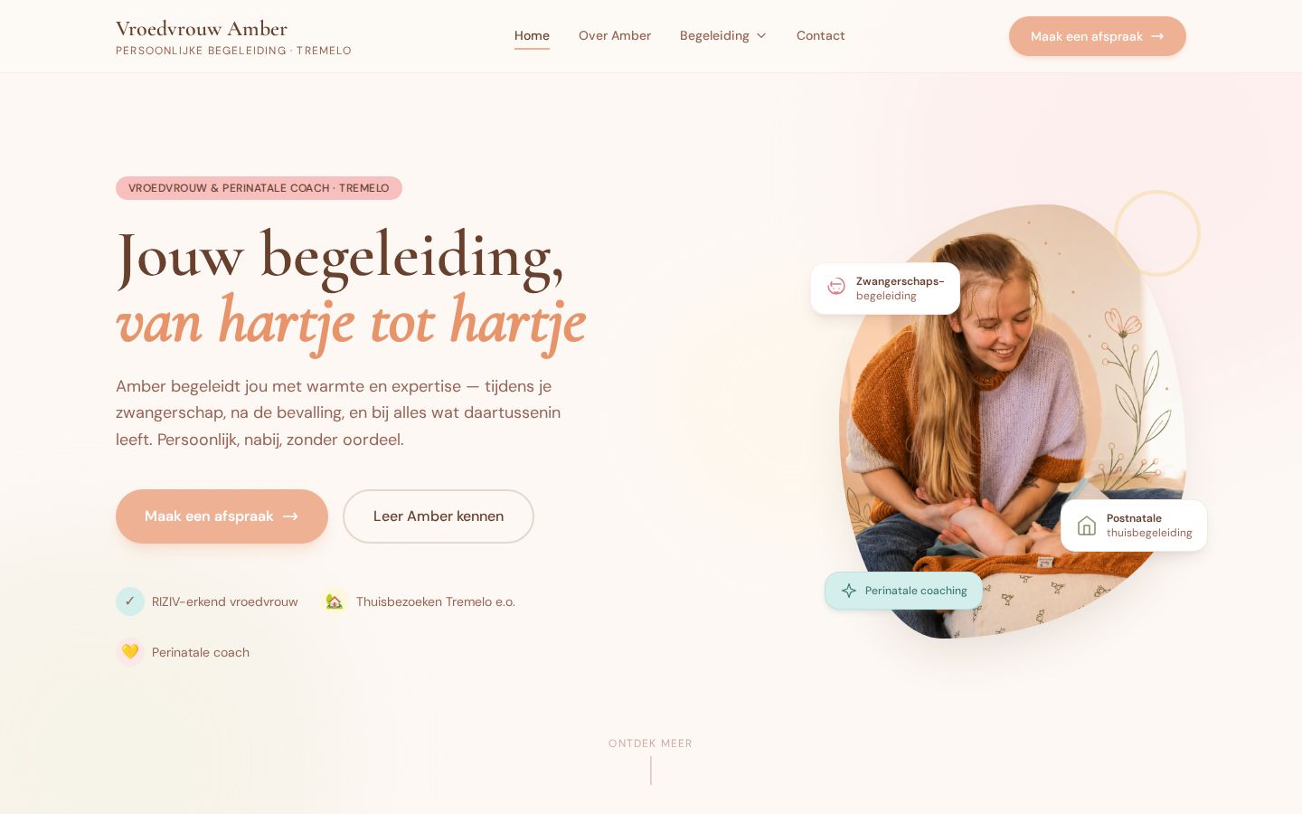
Amber is a midwife, a NICU nurse and a perinatal coach. When she started her own practice in Tremelo, she came to us with a clear idea of the care she wanted to give, and nothing yet to show it. We did the full start: direction, brand, website, a social media playbook and the launch of the site.
- Client
- Vroedvrouw Amber, midwife and perinatal coach
- Website
- vroedvrouwamber.be
- Sector
- Healthcare, independent practice, Tremelo (Belgium)
- Period
- 2026, live in August
- Our role
- Direction, brand identity, website, social media playbook, website launch
- Audience
- Expecting parents and young families in the region
- Channels
- Website, Instagram, Facebook, WhatsApp
- Language
- Dutch
- Deliverables
- See the full list
In short
- Challenge: a new practice in a field built on trust. Parents choose a midwife they feel safe with, often before they meet her.
- What we did: the direction and the tone, the brand identity, a website with every practical answer, a social media playbook and the launch of the site.
- Result: a brand that feels like Amber: warm, close and expert.
The challenge
Choosing a midwife is personal. Parents look for someone who knows what she is doing, and with whom they dare to share their worries. Most of them look online first, often late at night, often with a lot on their mind.
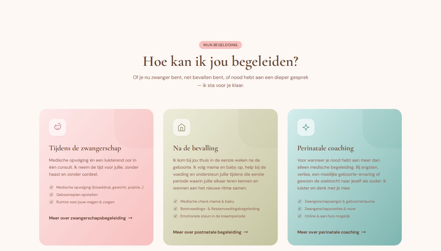
Amber offers three kinds of care: medical follow-up during pregnancy, home visits after the birth, and perinatal coaching for fear, loss or a difficult birth. That last one is a sensitive topic. The brand had to make room for it without making the whole practice feel heavy.
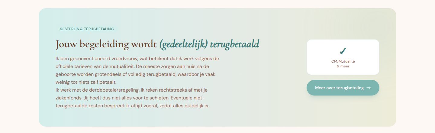
And there are practical questions people hesitate to ask: what does it cost, what does my health insurance pay back, do you come to my house?
Approach
Direction
We did: who Amber is, what she stands for, who she is for and how she sounds. Through an intake and moodboards. We first made a small brand, then changed course to a more accessible one.
Brand
We did: the name and wordmark, colours, typography, shapes and the tagline.
Website
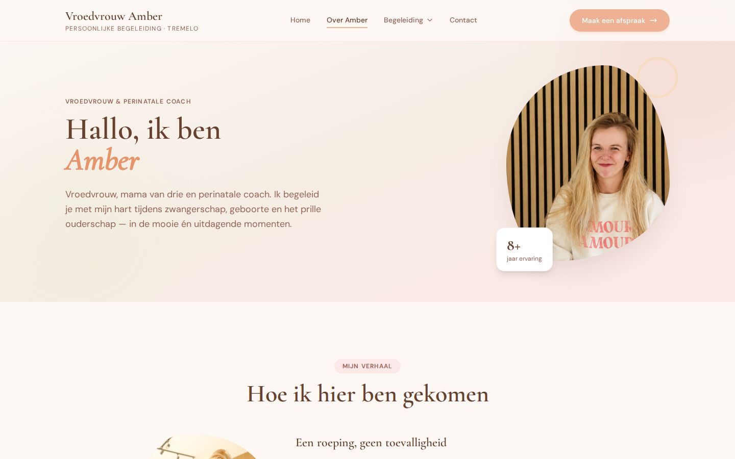
We did: structure, copy and design of the website, with pages per service, reimbursement, FAQ, contact and the legal pages.
Social media
We did: a content playbook with the tone of voice, the colours and the strategy. The content shoot follows in autumn 2026.
Launch
We did: the go-live of the website in August 2026, with small changes until October.
Direction
We started from Amber herself: her story, her way of working, and why she started her own practice. Four values came out of it, and they guide every text and every image:
- Zonder oordeelNo judgement. Every story is welcome.
- Brede kijkA broad view: medical, emotional and practical.
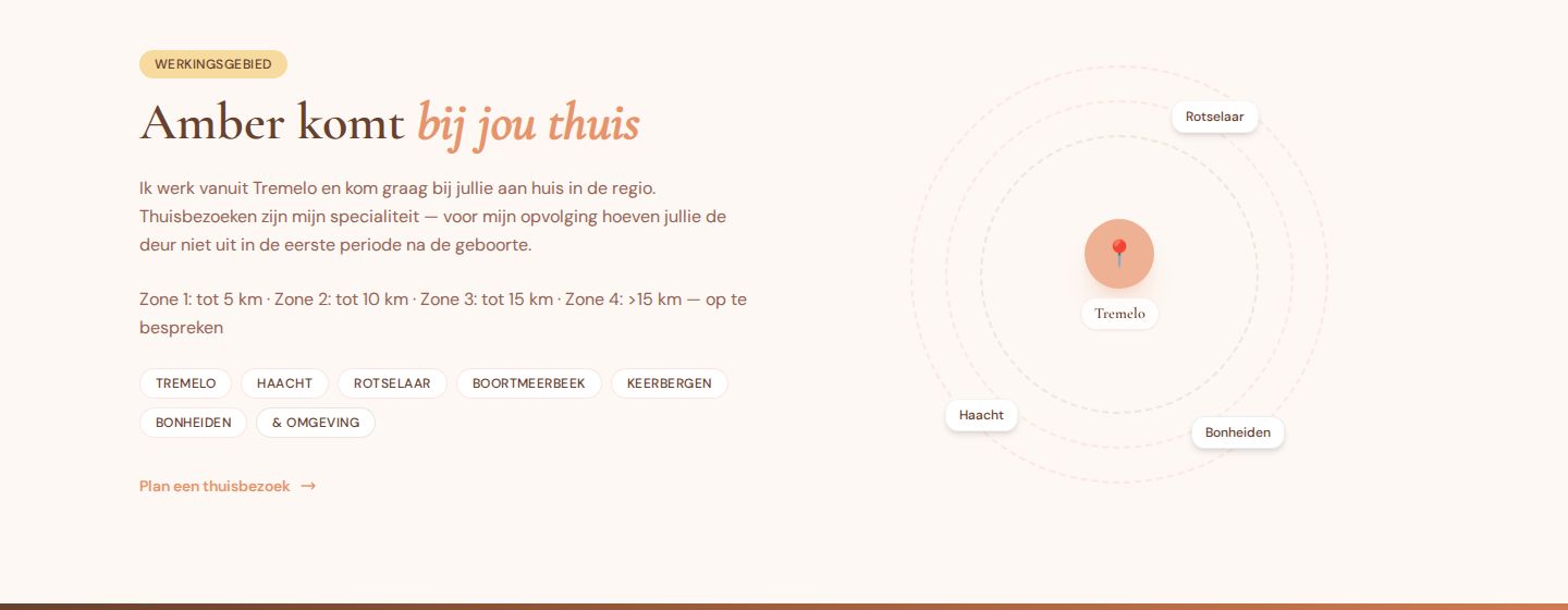
- Aan huisCare at home, in Tremelo and the area around it.
- BereikbaarEasy to reach, also for small questions.
The tone: warm and personal, in the first person, with a bit of humour. Amber talks as herself, a midwife and a mum of three, not as an institution. We set these values together with Amber: she wanted it accessible and warm, and we built on that.
Brand identity
Soft, warm and calm, but never sweet. Rounded shapes that feel like an embrace, an elegant serif for the headings and an easy sans for the text.
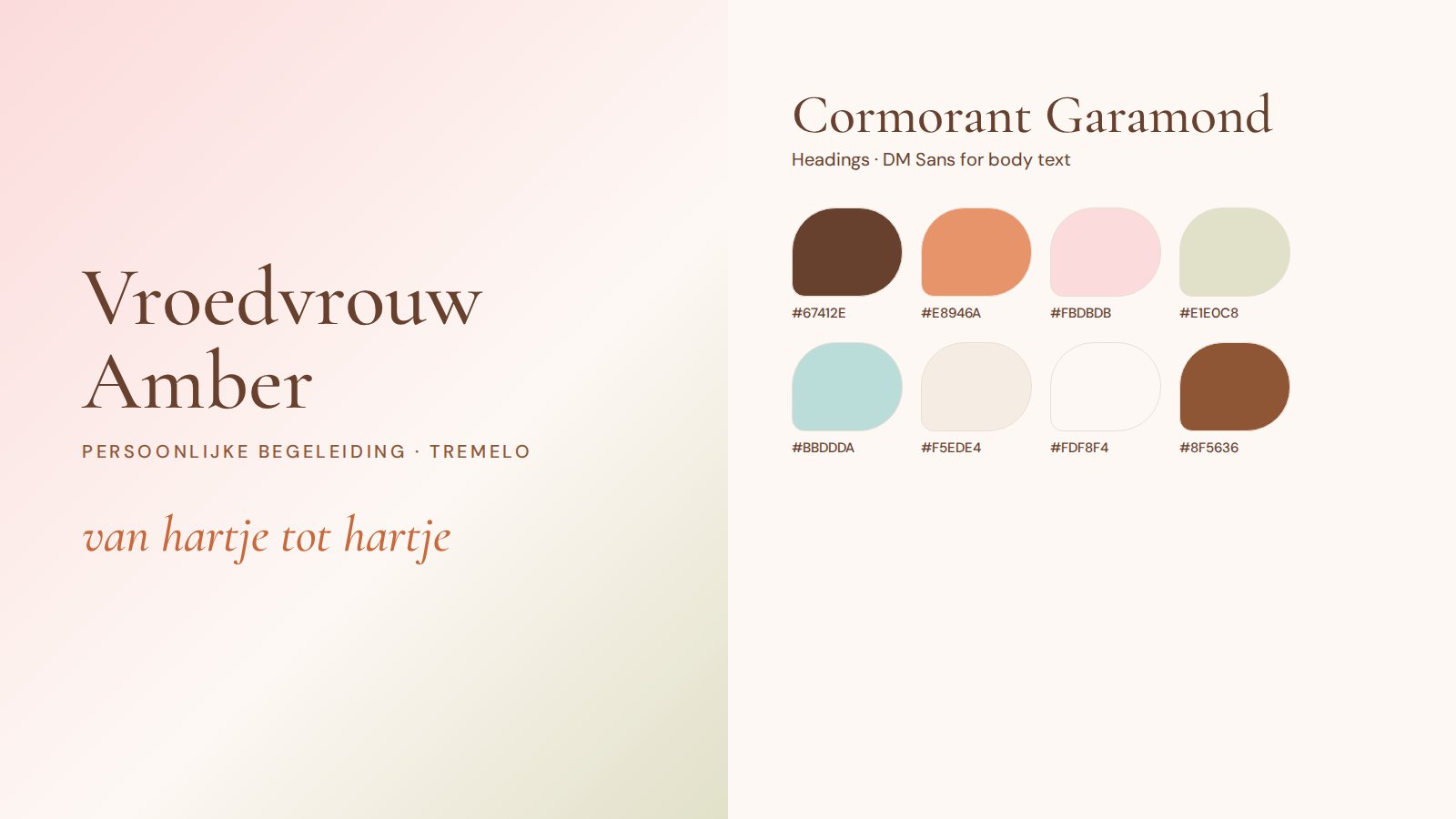
- The tagline: “van hartje tot hartje”, from heart to heart, from the first heartbeat to the baby in your arms.
- One colour per service: soft pink for pregnancy, sage for after the birth, mint for coaching. Visitors learn the system without reading a word.
- Real photos of Amber at work and at home, in rounded frames. Juwix took the first brand photos for the website; a bigger content shoot is still to come.
The website
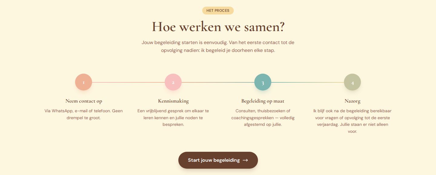
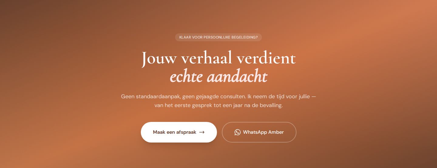
A website that answers questions before people have to ask them, and makes the first contact as easy as a WhatsApp message.
| Page | What it answers |
|---|---|
| Home | Who Amber is, what she offers, how it works and where she comes |
| About Amber | Her story, her work in neonatal care, her own practice, her values |
| Three service pages | Pregnancy, after the birth, perinatal coaching: what it is, what to expect, what it costs |
| Reimbursement | What the health insurance pays back, explained in plain words |
| FAQ | Questions in five groups: pregnancy, after the birth, coaching, practical, reimbursement |
| Contact | WhatsApp, email or phone, with how fast Amber usually answers |
| Privacy and accessibility | How health data is handled, and an honest accessibility statement |
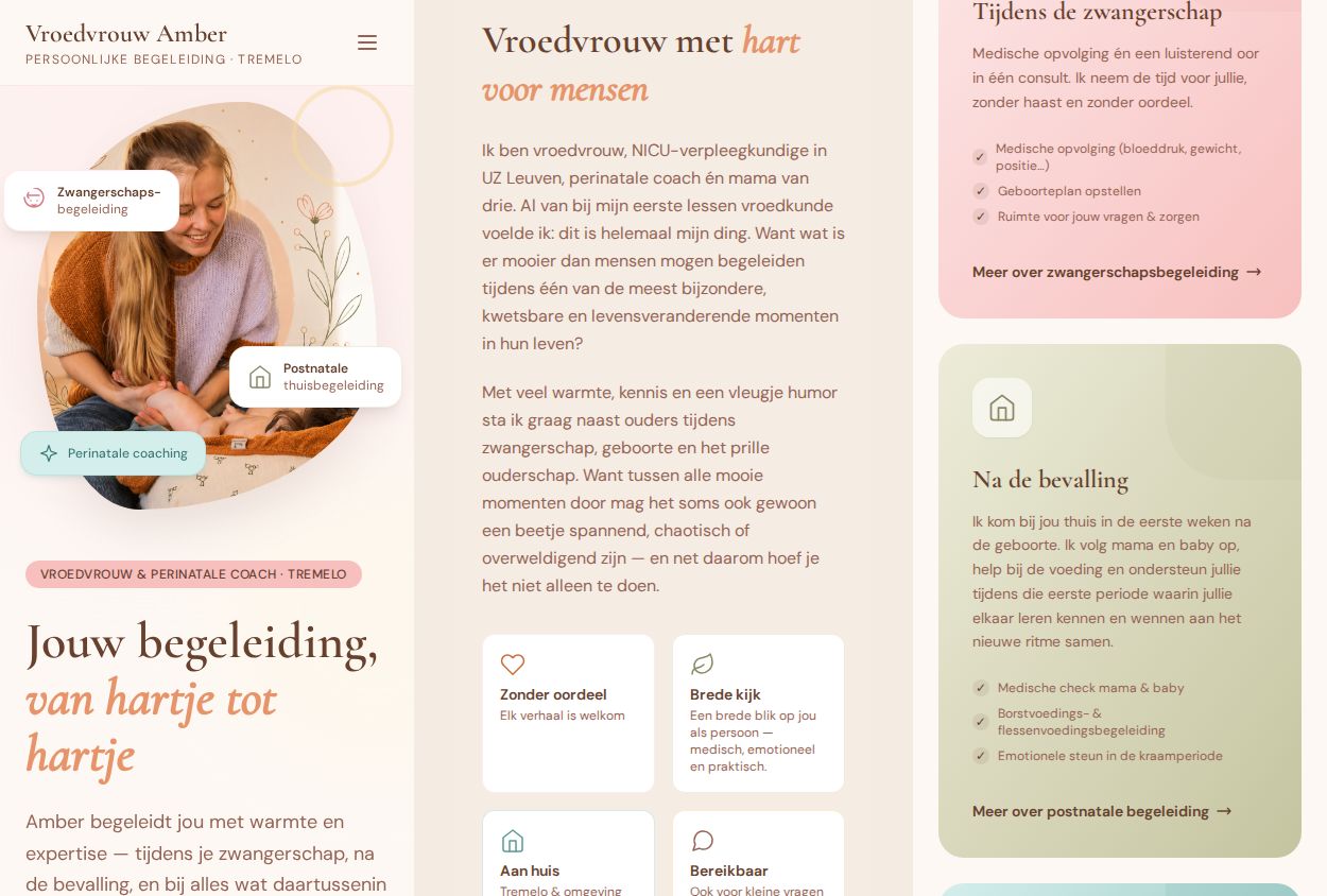
We left out the reviews from this case on purpose: they come from parents and touch on personal stories.
Social media and launch
This part is still running. The brand and the website are finished. We made a playbook for Amber’s content, with the tone of voice, the colours and the strategy. The content shoot follows in autumn 2026, so Amber can start strong on social media in 2027.
Accessibility
People often visit a site like this when they are tired, worried or holding a baby. So the site respects a reduced-motion setting, works with the keyboard, has a skip link, and comes with an honest accessibility statement that says what still needs work.A few small points are still being fixed. Amber’s site does not fall under the accessibility law, but we deliver it accessible anyway, because nothing stops us.
Results
Amber launched her practice with a brand and a website that feel like her. Social media follows after the content shoot.
Deliverables
- Brand direction and values
- Tone of voice
- Wordmark and tagline
- Colours and typography
- Website structure and copy
- Website design and build
- Three service pages
- Reimbursement page and FAQ
- Privacy policy and accessibility statement
- Social media playbook: tone of voice, colours and strategy
- Website launch
Starting your own practice?
We help you find your voice, and build the brand, the website and the launch around it. Small and personal, just like your practice.
Send a message