

A brand that grows from the ground up
Pro-Pitch looks after grass the professional way: football pitches, public green and premium private lawns. They had a clear belief, but no brand yet. We set the direction and made the logo, the brand, the content strategy and the website.
- Client
- Pro-Pitch, professional grass care
- Website
- pro-pitch.be
- Sector
- Sports field and lawn care, Belgium
- Period
- March to June 2026
- Our role
- Direction, logo, brand identity, web content strategy, web design, Webflow build
- Audiences
- Sports clubs, municipalities, private owners, job seekers
- Platform
- Webflow
- Standard
- WCAG 2.1 AA, with an accessibility statement
- Deliverables
- See the full list
In short
- Challenge: a company with a strong belief, very different audiences and no brand yet.
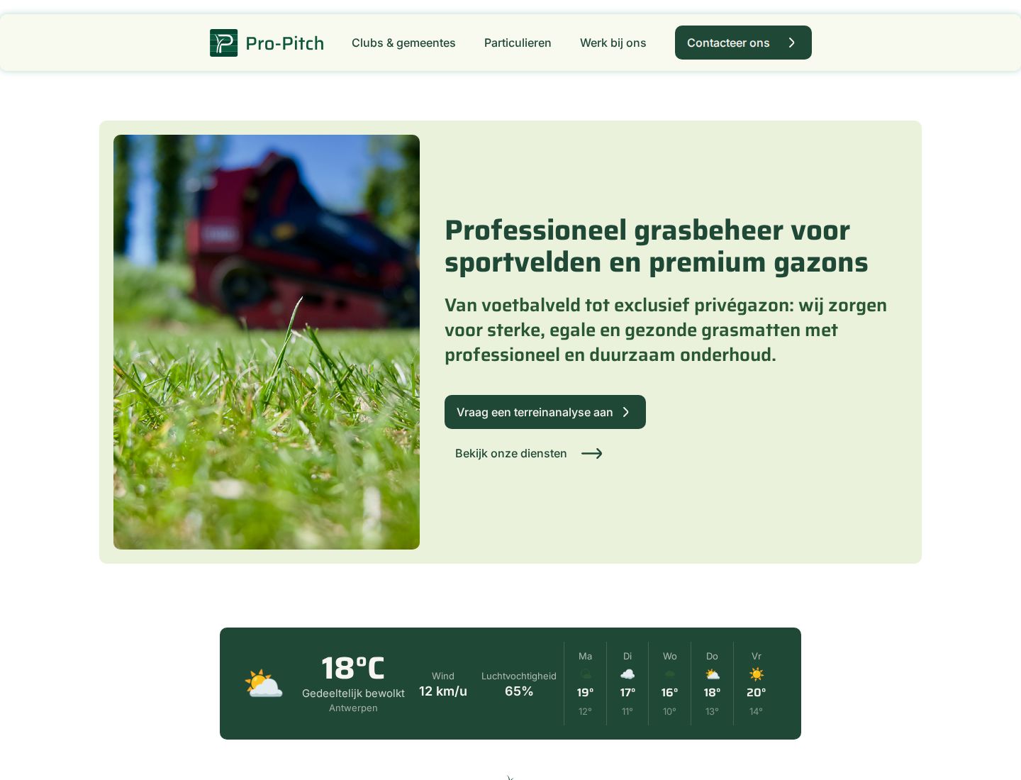
- What we did: the direction, a logo and brand identity, a content strategy for the web, and the website in Webflow.
- Result: one clear brand and a website that speaks to clubs and municipalities as well as to private owners.
The challenge
Pro-Pitch started from a concern: more and more football clubs switch to artificial grass, because natural grass is getting harder to maintain. Pro-Pitch believes a good natural pitch is more sustainable, healthier and more future-proof. They wanted to show that it can be done, with professional care.
That belief had to reach very different people. A football club and a municipality buy on proof, planning and the long term. A private owner wants a lawn that looks good again. And as a growing company, Pro-Pitch also needed to find people to work with them.
So the brand had to feel professional and expert, but also close and down to earth. And the website had to guide each group to what they need, without making it complicated.
Approach
Direction
We did: who Pro-Pitch is, what they stand for, who they are for and how they sound. We shared several moodboards, and the client pointed out competitors he liked and what he wanted to do differently. Out of six logo proposals, one clearly stood out, so we built on that.
Logo and brand
We did: the logo, colours, typography and icons.
Content strategy
We did: the structure of the site per audience, the key messages, the services in plain words, the FAQ and the calls to action.
Design and build
We did: the web design and the build in Webflow, mobile first, with the legal pages and an accessibility statement.
Launch
We did: go-live on pro-pitch.be, followed by an accessibility check and fixes. Live in June 2026. Pro-Pitch sets up its own social media and looks after the site itself.
Logo and brand
The logo is a P made from blades of grass, set in a square with the lines of a pitch. It works small, as an app icon or on a work shirt, and large, on a van or a sign. The lines come from a football pitch, because sports clubs are the main audience.
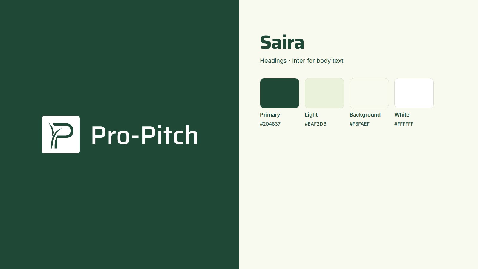
- One deep green (#204837) for text, buttons and the footer, with a light grass green and an off-white for calm backgrounds.
- Saira for headings: sturdy and sporty. Inter for body text: easy to read.
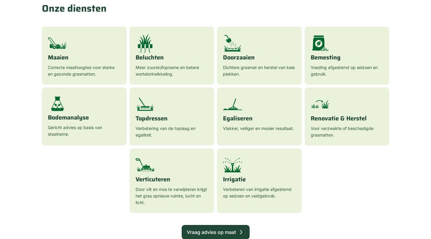
- A set of line icons for the basics of grass care and for every service, from mowing to soil analysis.
- Strong contrast. The dark green on white reaches 10.3:1, and on the light green 8.9:1, well above the 4.5:1 that WCAG asks.
Content strategy
We did not start from a list of services. We started from the people who visit, and what each of them needs to decide.
| Who | What they need | Where on the site |
|---|---|---|
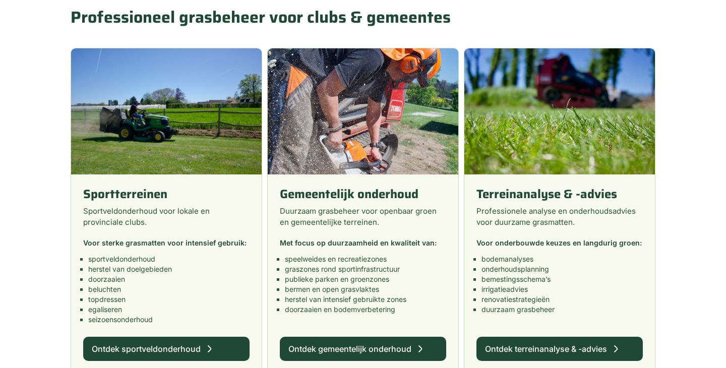
| Sports clubs | A pitch that stays playable all season | Sports fields: maintenance, goal areas, overseeding, aerating |
| Municipalities | Sustainable care for public green, planned for years | Municipal maintenance, plus analysis and advice |
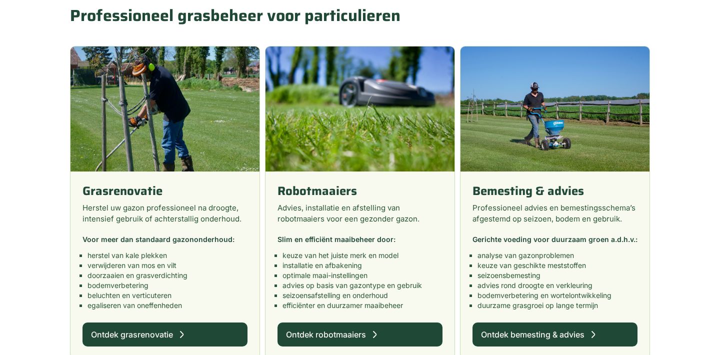
| Private owners | A lawn that looks good again | Lawn renovation, robot mowers, fertilising and advice |
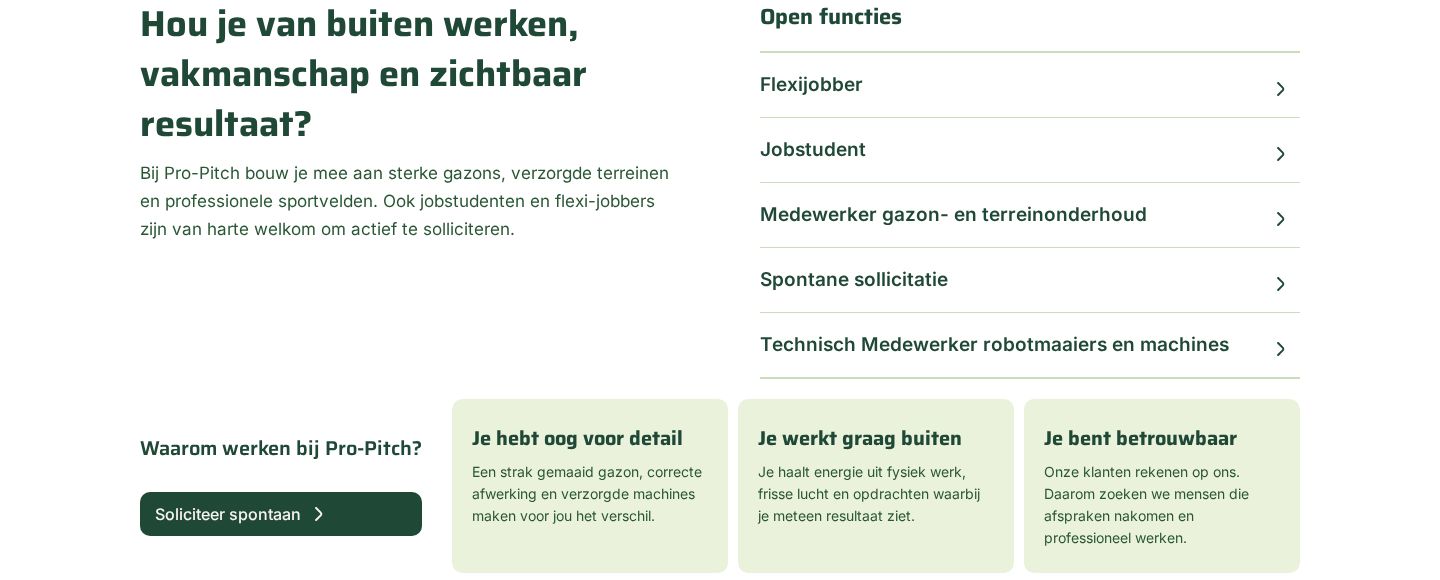
| Job seekers | To know what the work is like | “Werk bij ons”, with open jobs and what makes a good colleague |
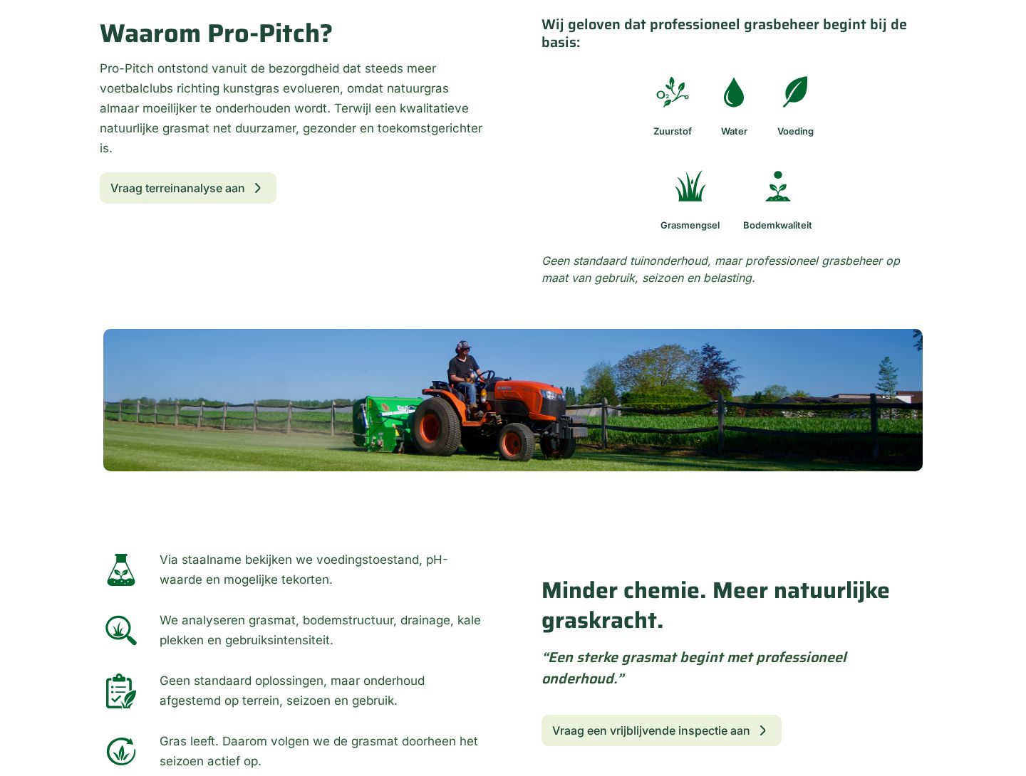
- Lead with the belief. “Why Pro-Pitch?” comes first: natural grass is worth it, if you care for it well.
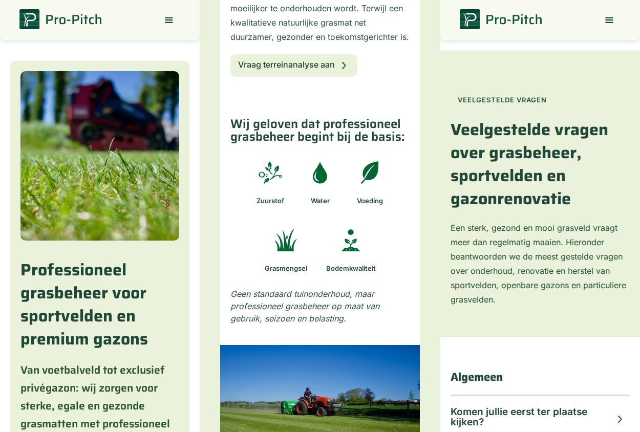
- The basics in five words. Oxygen, water, nutrition, grass mix and soil quality, each with an icon.
- Services in plain words. Each card says what it is for, and lists what it includes.
- One clear next step. “Vraag een terreinanalyse aan”: ask for an analysis of your field, instead of a vague “contact us”.
- Jargon explained. A FAQ with 33 questions in seven groups, by audience and by topic, from “What is scarifying?” to “What does it cost?”.
The website
A one-page homepage with an anchor menu for each audience, plus a full FAQ page and the legal pages. Built in Webflow, so the team can add jobs and update texts themselves.
- Weather on the homepage. A weather block for Antwerp with a five-day forecast: for grass care, the weather decides the planning. It shows live weather data.
- Every button names its action. “Ontdek sportveldonderhoud”, “Vraag advies op maat”, “Soliciteer spontaan”.
- Contact the way people like. A short form, email, phone and WhatsApp, and links to Instagram, Facebook and TikTok.
- Found in search. Clear page titles, meta descriptions and structured data for the organisation.
Accessibility
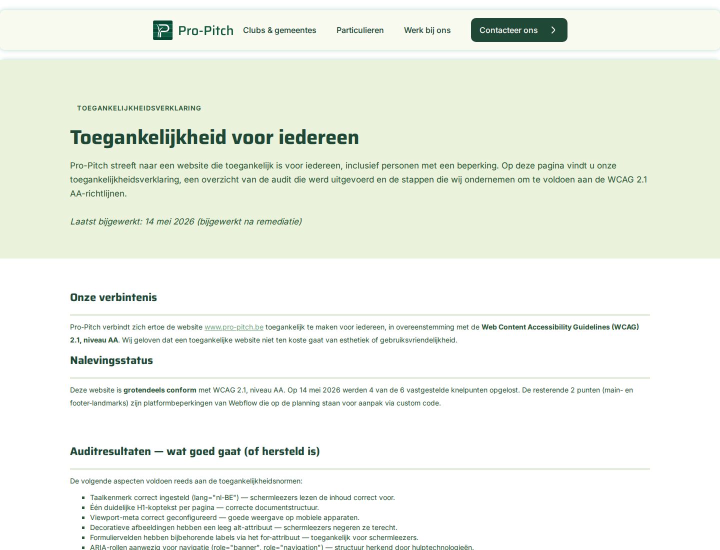
Pro-Pitch is a small company, not a public body. We still built for WCAG 2.1 AA, and gave the site an accessibility statement that says honestly what was checked and what is still planned.
| Standard | WCAG 2.1, level AA |
|---|---|
| How | Automated code analysis, plus a manual review of landmarks, headings, forms, images and link texts |
| Found | 6 issues |
| Fixed | 4 on 14 May 2026: a skip link, names for the logo link and the social links, and text alternatives for the service icons |
| Planned | Main and footer landmarks with custom code, and a manual test with keyboard and screen reader |
Results
Pro-Pitch went from an idea to a brand people recognise, on a website that speaks to every audience. Right after the launch, the first clubs signed up, and Pro-Pitch is now growing its maintenance team.
Deliverables
- Brand direction and positioning
- Logo, in colour and in white
- Colours and typography
- Icon set for services and basics
- Web content strategy per audience
- Website copy and calls to action
- FAQ: 33 questions in 7 groups
- Web design, mobile first
- Webflow website
- Careers section
- Privacy and cookie policy pages
- Accessibility statement
What we learned
The client came with an example site made with AI. It was not what he needed: too much information, no clear positioning, and colours that did not fit the brand, so it would attract the wrong clients. That can be hard to see for a new client. Defining the value of the brand and the site first makes the difference.
Starting something new?
We help you find your direction, and build the brand and the website around it. Accessible from the first sketch.
Send a message